

Strategy
Brand Identity
Copywriting
Illustration
Print Design
Packaging Design
Little Larch

Project Details
Little Larch
Little Larch is changing the game when it comes to sensory play for kids, with innovative products that are good for little hands, and better for the planet. Working closely with the brand’s founder, we developed a new visual and verbal identity to match the company’s goals and ambition: to expand outside of Canada and become a household name in the industry. From bespoke typography, iconography, and illustrations to updated packaging designs for their signature Doughs, Glitter Doughs, and Potion Plays, the end result is a fun, bold and expressive brand that stands out on shelves and doesn’t take itself too seriously.
Features
The Dieline, The Brand Identity, Design by Women, Pent Awards, Logobook
Collaborators
Photography, Still Olive
Design, Gijs Lammers

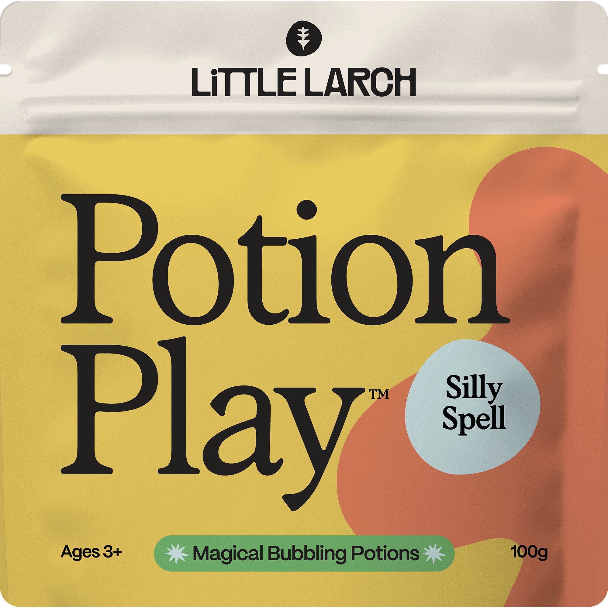
Packaging Play
For the packaging design, we drew inspiration from the idea of blending sophisticated, art gallery-worthy aesthetics with a playful, childlike charm. The design needed to feel like something you'd find in a curated gift shop, but also have a handmade, whimsical quality, as if a child themselves had drawn it.
The result is a look that stands out on countertops, makes kids feel special, and turns the packaging into a piece of art in its own right.


